2021 UMN interdisciplinary health data competition
Watch the presentation here: Link
This past month I had the opportunity to compete in the 2021 edition of the Interdisciplinary Health Data competition, put on by the University of Minnesota Carlson School of Management. I joined a team of two other CTSI TL1 scholars, Serena Xiong and Emily Groene Faherty, both in the School of Public Health.
The competition requires use of one of two datasets, and can be supplemented by any other publically available dataset. The required dataset, unsurprisingly, was COVID-19 hospitalization and community impact data from across the country. As this was March, and vaccination efforts were in full swing, our team quickly decided to focus on vaccination data. Specifically, we were wondering if the early reports of vaccination disparities could be seen in the publically available data.
Approach
Our approach was straightforward - could we identify demographic, socioeconomic, or COVID-19 related factors that correlate with the vaccination rate in a specific county?
To start, we needed to get the vaccination rate in each county. There are two options for this: 1. Use the absolute percentage of adults vaccinated at a fixed time point or 2. Use the rate at which a county is vaccinating its population. We decided to use the latter, as we thought it would give a more dynamic representation of how the vaccination process was going in a county.
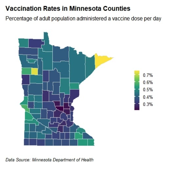
We acquired the weekly vaccination counts per county from the Minnesota Department of Health. All I needed to do then was to fit a linear model to each county, where the input variable was time and the output variable was the percentage of vaccinated adults in the county. Then - the coefficient of the time variable gives the rate at which the county was vaccinating its population. I learned how to plot to a map to make the following figure:

At that point in time, Cook county and Mahnomen county had absurdly high rates of vaccination. We did a little digging, and found that Cook county had a extremely robust COVID-19 information site, with lots of helpful info on where to get the vaccine. Mahnomen county is entirely located within a Native American reservation - and is allowed to set its own rules for vaccine elligibility.
The next step of our analysis was to see if we could build a model predicting the vaccination rate in a county based on demographic, socioeconomic, or COVID-19 related factors. First we assembled a large dataset of potential covariates; ranging from demographic factors like age, race, and ethnicity to socioeconomic factors like broadband access to COVID-19 factors like nursing home beds per capita, or the peak COVID-19 caseload during the pandemic. To do an initial search, we calculated simple correlation between these factors on a county level and the county’s vaccination rate, which you can see here:

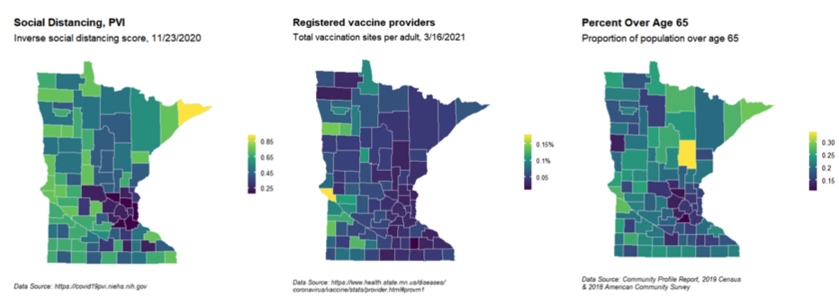
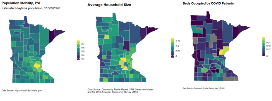
As nursing homes were the first to get the vaccine, we were not surprised by that positive correlation. The surprise here was the “social distancing” metric. This metric gives the overall level of county wide adherence to social distancing guidelines (I am not sure how this is calculated - maybe some combination of sales or attendance figures in public?). The fact that it is positively correlated means that counties that had a higher adherence to social distancing guidelines had higher vaccination rates. We plotted the top 6 correlated features on maps of Minnesota:


You’ll note that a lot of the factors negatively correlated with vaccination rate are highest in the counties directly surrounding the twin cities. I don’t have a great explanation for this - but in my head it involves Facebook and anti-vaccination sentiments among the suburbs.
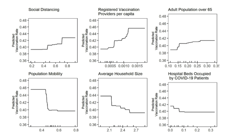
Finally, We built a gradient boosting regressor which outperformed a baseline “mean-value” regression line. One of the issues with machine learning models in general is interpretability. GBMs can get around this by what’s called a partial dependence plot. A partial dependence plot looks at how the output of the model changes across the range of a covariate, keeping all other covariates constant. It is not a perfect method, but it can tell you how a model behaves under certain variable changes. The plots of these back up a lot of the knowledge gained from the correlation plots:

Our conclusions were that vaccination rates tended to be lowest in the suburbs, but the state was actually doing a pretty good job of vaccinating the hard hit rural areas.
Final thoughts
While we were named as one of the five finalist teams out of 26, which is why we got to present live to a panel of judges; we unfortunately placed just outside of the money. There are a few things I would’ve done differently:
- Perform the same analysis on a zipcode wide level, where disparities might be more apparent. This was not possible for data in MN but could be done in Chicago, where zipcode vaccination data is available.
- Produce descriptive statistics of vaccination rate against some of the disparity measures we had - skipping straight to correlations and predictive models leaves out a big chunk of the story.
Nonetheless, I had a great time working on this. It was my first exposure to public health style datasets, and I really enjoyed working with real world data with two of my talented peers. I linked our presentation at the top of the post if you would like to watch it. All the analysis was done in R, and I can share those scripts upon request.